
三角形を生成・配置する
CSSには三角形を描くプロパティはないので、borderプロパティを上手に使って三角形を表現し、:after疑似要素を使ってボックス上に配置する。このあたりは、前回のドッグイヤーデザインと同じだ。
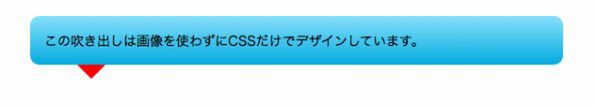
:after疑似要素に対して、太さ15px・実線の赤、緑、青、黄のボーダーを適用すると以下のようになる。
.speech-bubble p:after {
content : "";
position : absolute;
bottom : -15px;
left : 50px;
width : 0;
height : 0;
border-width : 15px 15px 15px 15px;
border-style : solid;
border-color : red green blue yellow; }
三角形の位置を調整し、ボックスにぴったり隣接する位置に移動させよう。先ほどのbottom : -15px;を、bottom : -30px;へ変更するとちょうどよい場所に配置できる。
.speech-bubble p:after {
content : "";
position : absolute;
bottom : -30px;
left : 50px;
width : 0;
height : 0;
border-width : 15px 15px 15px 15px;
border-style : solid;
border-color : red green blue yellow; }
青、緑、黄部分のボーダーをtransparent(透明)に設定すると、ふきだしの「しっぽ」の完成だ。
.speech-bubble p:after {
content : "";
position : absolute;
bottom : -30px;
left : 50px;
width : 0;
height : 0;
border-width : 15px 15px 15px 15px;
border-style : solid;
border-color : red transparent transparent transparent; }
仕上げに、赤になっているしっぽの色をボックスの色にあわせよう。今回は、「#05abe0」を適用した。
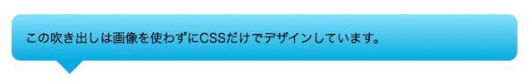
border-width : 15px 15px 15px 15px;
border-style : solid;
border-color : #05abe0 transparent transparent transparent;
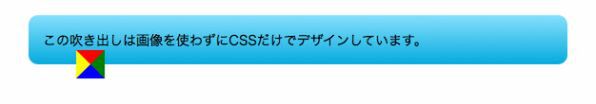
以上で基本的なふきだしの完成だ。
■サンプル1[CSS]
.speech-bubble p {
position : relative;
padding : 15px;
color : #000;
width : 50%;
margin : 40px auto 0;
/* css3 */
-webkit-border-radius : 10px;
-moz-border-radius : 10px;
border-radius : 10px;
background-color: #87e0fd;
background-image: -moz-linear-gradient(top,#87e0fd 0%, #53cbf1 40%, #05abe0 100%); /* FF3.6 */
background-image:-o-linear-gradient(top, #87e0fd 0%, #53cbf1 40%, #05abe0 100%); /* Opera11.10+ */
background-image: -webkit-gradient(linear,left top,leftbottom,from(#87e0fd),color-stop(0.4, #53cbf1),to(#05abe0)); /* Saf4+, Chrome*/
background-image: -webkit-linear-gradient(top, #87e0fd 0%, #53cbf1 40%,#05abe0 100%); /* Chrome 10+, Saf5.1+ */
background-image:linear-gradient(top, #87e0fd 0%, #53cbf1 40%, #05abe0 100%);
filter:progid:DXImageTransform.Microsoft.gradient(startColorStr='#87e0fd',EndColorStr='#53cbf1'); /* IE6-IE9 */}
/* 三角形部分 */
.speech-bubble p:after {
content : "";
position : absolute;
bottom : -30px; /*三角形の上下位置*/
left : 50px; /*三角形の左右位置*/
right : auto;
width : 0;
height : 0;
border-width : 15px 15px 15px 15px;
border-style : solid;
border-color : #05abe0 transparent transparent transparent; }
.speech-bubble.top p:after {
top : -30px; /*三角形の上下位置*/
right : 50px; /*三角形の左右位置*/
border-width : 15px 15px 15px 15px;
border-color : transparent transparent #87e0fd transparent; }
.speech-bubble.right p:after {
top : 10px; /*三角形の上下位置*/
left : -30px; /*三角形の左右位置*/
border-width : 15px 15px 15px 15px;
border-color : transparent #47c6ee transparent transparent; }


