
つややかなグラデーションをCSS3で表現する
CSS3では、backgroundプロパティの値に「gradient」を設定することで背景にエレガントなグラデーションを設定できる。gradientを使えば数値を変更するだけでグラデーションを自由に変更できるので、画像編集ツールで画像ファイルを何度も調整するより断然便利だ。
gradientは、Safari4.0以降とFirefox 3.6以降で利用できるが、記述方法は以下のように異なっている。
【gradientの基本】(Safari4.0以降)
-webkit-gradient(linear, 開始位置, 終了位置, color-stop(色を追加する位置, 追加する色));
【gradientの基本】(Firefox3.6以降)
-moz-linear-gradient(開始位置, 終了位置,from(開始時の色),
                                   color-stop(色を追加する位置, 追加する色),
                                   to(終了時の色));
開始位置/終了位置は、位置キーワード(top/bottom/left/right/center)または数値(ピクセルなど)で指定する。color-stopはグラデーションの途中に色を追加する引数で、いくつでも追加できる。色を追加する位置は%で指定する。色の指定には、透明度を設定できるrgba()が使える。
今回のサンプルでは、backgroun-colorプロパティで背景を塗りつぶしておき、その上に段階的に上方向から下方向にかけて10%ずつ濃くしたグラデーションマスクを重ねている。また、マウスオーバー(:hover)時にはgradientの値を変更し、より濃いグラデーションにしている。
■通常時のナビゲーションバー
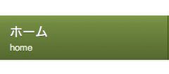
Safari4.0での実行結果
/*mozilla 3.6+ グラデーション マスク*/
    background-image: -moz-linear-gradient(top, bottom, /*上から下にグラデーション*/
                                   from(rgba(255, 255, 255, .2)), /*透明度 80%*/
                                   color-stop(10%, rgba(255, 255, 255, .3)), /*上から10%に透明度 70%*/
                                   to(rgba(255, 255, 255, .4)));/*透明度 60%*/
/*Safari4.0+ グラデーション マスク*/
    background-image: -webkit-gradient(linear, left top, left bottom,/*上から下にグラデーション*/
                                   color-stop(0, rgba(255, 255, 255, .2)), /*透明度 80%*/
                                   color-stop(50%, rgba(255, 255, 255, .3)),/*透明度70%*/
                                   color-stop(90%, rgba(255, 255, 255, .4)));/*透明度60%*/
}
■マウスオーバー時のナビゲーションバー(:hover)
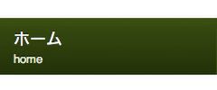
Safari4.0での実行結果
/*mozilla 3.6+ グラデーション マスク*/
    background-image: -moz-linear-gradient(top, bottom,
                                   from(rgba(255, 255, 255, .1)),
                                   color-stop(10%, rgba(255, 255, 255, .2)),
                                   to(rgba(255, 255, 255, .3)));
/*Safari4.0+ グラデーション マスク*/
    background-image: -webkit-gradient(linear, left top, left bottom,
                                   color-stop(0, rgba(255, 255, 255, .1)),/*透明度 90%*/
                                   color-stop(50%, rgba(255, 255, 255, .2)), /*透明度 80%*/
                                   color-stop(90%, rgba(255, 255, 255, .3)));/*透明度 70%*/
}


