
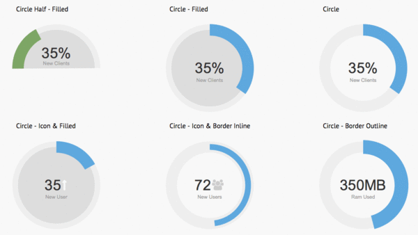
STEP 4:SVGアニメーションでの実装
ここまでの円グラフは、画像を重ねて表示し、CSS Keyframesでアニメーションさせるものだが、SVGアニメーションでも同様のグラフが実装できる。SVGを使うと、グラフのサイズや塗りを簡単に変更できるので、デザインがアレンジしやすい。各図形の塗りには以下のようなドットやラインのパターンも設定できる。
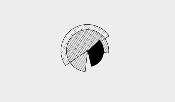
グラフはSVGのパスとして用意し(SVGデータの作成方法は前回の記事を参照)、path要素として記述する。
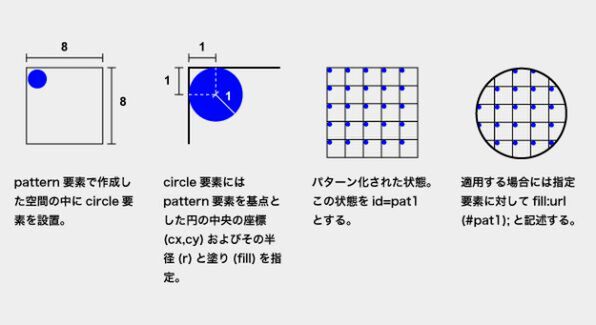
塗りとして利用するパターンは、ドキュメント内で自由に参照できるようにdefs要素内にpattern要素を記述して定義する。具体的なパターンの作り方と適用の仕方は以下の図を参照してほしい。例ではpattern要素内にcircle要素で小さな円を描き、ドットのパターンを作っている。
円を回転させるSVGアニメーションは、animateTransform要素で指定する。animateTransform要素は、移動、拡大縮小、回転など、パスの変形アニメーションを定義する要素だ。変形の種類(type)、開始(from)と終了(to)の状態、アニメーション時間(dur)、リピート回数(repeatCount)を指定する。
以下のように記述すると、0度から360度へ時計回りに6秒間かけて回転するアニメーションが繰り返し実行される。
■ソースコード(CSS)
.stage{
  position: relative;
  height: 300px;
  width: 300px;
}
.stage svg{
  position: absolute;
  height: 300px;
  width: 300px;
}
■ソースコード(HTML)
<div id="wrap">
  <div class="stage">
    <svg width="400px" height="400px">
      <defs>
        <pattern id="pat1" x="0" y="0" width="8" height="8" patternUnits="userSpaceOnUse" >
        <circle cx="1" cy="1" r="1" style="fill:#000" />
        </pattern>
        <pattern id="pat2" x="2" y="2" width="8" height="8" patternUnits="userSpaceOnUse" >
        <line x1="0" y1="0" x2="10" y2="10" style="stroke:#000;stroke-width:1"/>
        </pattern>
      </defs>
      <g>
      <path style="stroke:#000;stroke-width:2;fill:url(#pat1);" d="..."/>
      <animateTransform attributeName="transform" attributeType="XML" type="rotate" from="0 150,150" to="-360 150,150" dur="6s" repeatCount="indefinite" />
      </g>
      <g>
      <path style="stroke:#000;stroke-width:2;fill:url(#pat2);" d="..."/>
      <animateTransform attributeName="transform" attributeType="XML" type="rotate" from="0 150,150" to="360 150,150"dur="4s" repeatCount="indefinite" />
      </g>
      <g>
      <path style="stroke:#000;stroke-width:2;fill:#000;" d="..."/>
      <animateTransform attributeName="transform" attributeType="XML" type="rotate" from="0 150,150" to="-360 150,150"dur="2s" repeatCount="indefinite" />
      </g>
    </svg>
  </div>
</div>
DEMO > http://zxcvbnmnbvcxz.com/demonstration/as/004/4.html
対応ブラウザー:Firefox, Chrome, Safari, Opera


