
ふきだしのバリエーション
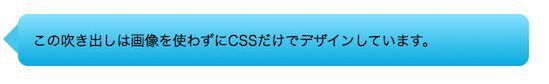
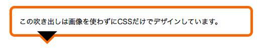
サンプル1で作成したCSSを応用すると、さまざまなふきだしのデザインを作成できる。しっぽの位置を上・左に変更したのがサンプル2、3だ。
サンプル2
■サンプル2[CSS]
.speech-bubble.top p:after {
top : -30px; /*三角形の上下位置*/
right : 50px; /*三角形の左右位置*/
border-width : 15px 15px 15px 15px;
border-color : transparent transparent #87e0fd transparent; }
サンプル3
■サンプル3[CSS]
.speech-bubble.right p:after {
top : 10px; /*三角形の上下位置*/
left : -30px; /*三角形の左右位置*/
border-width : 15px 15px 15px 15px;
border-color : transparent #47c6ee transparent transparent; }
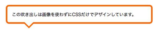
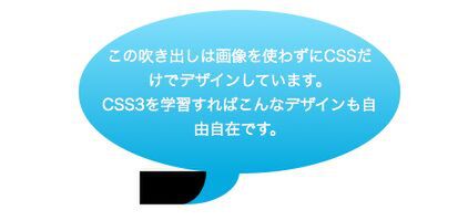
白抜きのふきだし
さらにCSSに手を加えると「白抜き」のふきだしも作れる。以下のふきだしは、:before と :after を利用して2つの三角形を配置し、片方の三角形の色を白に変更することで白抜きに見せている。
三角形を描き…
もう1つの三角形を重ねて白抜きにする
.speech-bubble p:before {
content : "";
position : absolute;
bottom : -40px; /*三角形の上下位置*/
left : 50px; /*三角形の左右位置*/
right : auto;
width : 0;
height : 0;
border-width : 20px;
border-style : solid;
border-color : #ff6600 transparent transparent transparent; }
.speech-bubble p:after {
content : "";
position : absolute;
bottom : -34px; /*三角形の上下位置*/
left : 50px; /*三角形の左右位置*/
width : 0;
height : 0;
border-width : 20px;
border-style : solid;
border-color : #fff transparent transparent transparent; }
楕円形のバブル
楕円形の「バブル」も「白抜き」を応用して作れるふきだしのテクニックだ。 border-radius プロパティを利用して楕円形のテキストボックスを作り(.speech-bubble p)、そのすぐ下に:before擬似要素を利用して角丸の三角形(右下の角にのみ大きくアールを付けたボックス)を配置する。
■サンプル5[CSS]
.speech-bubble p {
position : relative;
padding : 30px 20px;
color : #fff;
width : 250px;
margin : 40px auto 0;
text-align : center;
/* css3 */
-webkit-border-radius : 200px/100px;
-moz-border-radius : 200px/100px;
border-radius : 200px/100px;
background : #87e0fd; /* old browsers */
background : -moz-linear-gradient(top, #87e0fd 0%, #53cbf1 40%, #05abe0 100%); /* firefox */
background : -webkit-gradient(linear, left top, left bottom, color-stop(0%,#87e0fd), color-stop(40%,#53cbf1), color-stop(100%,#05abe0)); /* webkit */
filter : progid:DXImageTransform.Microsoft.gradient( startColorstr='#87e0fd', endColorstr='#05abe0',GradientType=0 ); /* ie */}
/* 三角形部分 */
.speech-bubble p:before {
content: "";
position: absolute;
z-index: -1;
bottom: -30px;
right: 50%;
width: 0;
height: 30px;
border-right: 60px solid #05abe0;
background: #05abe0;
-moz-border-radius-bottomright: 80px 50px;
-webkit-border-bottom-right-radius: 80px 50px;
border-bottom-right-radius: 80px 50px;
-moz-transform: translate(0, -2px);
-webkit-transform: translate(0, -2px);
-o-transform: translate(0, -2px);
transform: translate(0, -2px); }
.speech-bubble p:after {
content: "";
position: absolute;
z-index: -1;
bottom: -30px;
right: 50%;
width: 60px;
height: 30px;
background: #fff;
-moz-border-radius-bottomright: 40px 50px;
-webkit-border-bottom-right-radius: 40px 50px;
border-bottom-right-radius: 40px 50px;
-moz-transform: translate(-30px, -2px);
-webkit-transform: translate(-30px, -2px);
-o-transform: translate(-30px, -2px);
transform: translate(-30px, -2px); }
角丸の三角形の上に、もう1つ角丸の三角形を配置する(以下の黒のボックス)。
.speech-bubble p:after {
content: "";
position: absolute;
z-index: -1;
bottom: -30px;
right: 50%;
width: 60px;
height: 30px;
background: #000;
-moz-border-radius-bottomright: 40px 50px;
-webkit-border-bottom-right-radius: 40px 50px;
border-bottom-right-radius: 40px 50px;
-moz-transform: translate(-30px, -2px);
-webkit-transform: translate(-30px, -2px);
-o-transform: translate(-30px, -2px);
transform: translate(-30px, -2px); }
2番目の角丸の三角形を白に変更したらバブルの完成だ。
background: #fff;
◆
いかがだろうか。今回紹介したふきだしのデザインテクニックは、いずれも:before と :after を活用することで、シンプルなマークアップを実現している。アイデア次第ではもっといろいろなデザインができるので、ぜひ挑戦してほしい。
参考:http://nicolasgallagher.com/pure-css-speech-bubbles/
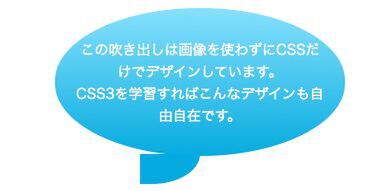
今回のお手本
|
|
|---|
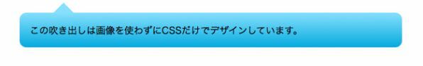
| 今回のお手本。画像を一切使用せずにCSS3だけでデザインできる(Mac OS X 10.6/Safari 5.0で表示) |
-->


