サンプルで学ぶTwitter Bootstrapの使い方:中編 (3/5)
2013年08月19日 11時00分更新

グリッドの入れ子で一覧部分をマークアップ
サンプルページのメインコンテンツとなる一覧部分は、ul/li要素と、Twitter Bootstrapのグリッドシステムを応用して作成します。
メインコンテンツのカラムは8本のグリッドで作成していました(関連記事)。このグリッドの中にグリッドを入れ子にして、ボックス(本の紹介)を水平方向に4つずつ並べます。
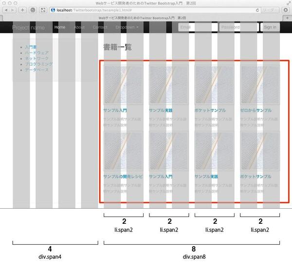
グリッドを入れ子にする場合、入れ子にするspanの合計は親要素に指定したspanxのxと一致する必要があります(関連記事)。4つのボックスを8本のグリッド内に並べるには、ボックスあたり2本のグリッドを使うことになるので、li.span2を4つ並べればOKです。
このとき、入れ子にするspanを連続で配置すると、親要素のspanx値を超えたときに、自動的に改行されます。
<div class="span8">
  <h3>書籍一覧</h3>
  <hr>
  <div class="row">
    <ul class="unstyled">
      <li class="span2">
        <a href="#"><img class="img-polaroid" src="img/twsample1.jpg"></a>
        <a href="listings.html"><h5>サンプル入門</h5></a>
        <p class="muted"><small>サンプル説明サンプル説明サンプル説明</small></p>
      </li>
      <li class="span2">
        <a href="#"><img class="img-polaroid" src="img/twsample1.jpg"></a>
        <a href="listings.html"><h5>サンプル実践</h5></a>
        <p class="muted"><small>サンプル説明サンプル説明サンプル説明</small></p>
      </li>
      <li class="span2">
        <a href="#"><img class="img-polaroid" src="img/twsample1.jpg"></a>
        <a href="listings.html"><h5>ポケットサンプル</h5></a>
        <p class="muted"><small>サンプル説明サンプル説明サンプル説明</small></p>
      </li>
      <li class="span2">
        <a href="#"><img class="img-polaroid" src="img/twsample1.jpg"></a>
        <a href="listings.html"><h5>ゼロからサンプル</h5></a>
        <p class="muted"><small>サンプル説明サンプル説明サンプル説明</small></p>
      </li>
      <li class="span2">
        <a href="#"><img class="img-polaroid" src="img/twsample1.jpg"></a>
        <a href="listings.html"><h5>サンプルの開発レシピ</h5></a>
        <p class="muted"><small>サンプル説明サンプル説明サンプル説明</small></p>
      </li>
      <li class="span2">
        <a href="#"><img class="img-polaroid" src="img/twsample1.jpg"></a>
        <a href="listings.html"><h5>サンプル入門</h5></a>
        <p class="muted"><small>サンプル説明サンプル説明サンプル説明</small></p>
      </li>

      <li class="span2">
        <a href="#"><img class="img-polaroid" src="img/twsample1.jpg"></a>
        <a href="listings.html"><h5>サンプル実践</h5></a>
        <p class="muted"><small>サンプル説明サンプル説明サンプル説明</small></p>
      </li>
      <li class="span2">
        <a href="#"><img class="img-polaroid" src="img/twsample1.jpg"></a>
        <a href="listings.html"><h5>ポケットサンプル</h5></a>
        <p class="muted"><small>サンプル説明サンプル説明サンプル説明</small></p>
      </li>
    </ul>
  </div>
</div>
親要素で指定した数値のspan8になるまで、入れ子になっているspan2が横並びで繰り返し表示され、span8を超えると自動的に次の行に折り返して表示されます。
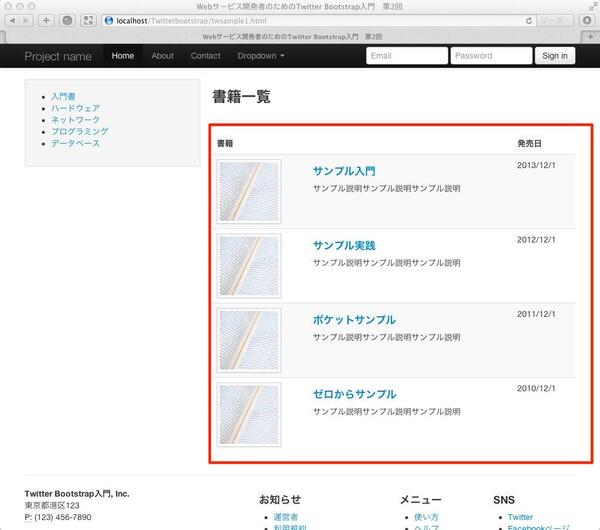
一覧部分をテーブルで作る
一覧部分はグリッドではなく、table要素でも作成できます。table要素のclass属性に「table table-striped」を指定すると、各行で色分けされたテーブルが作成できます。
<table class="table table-striped">
  <thead>
    <tr>
      <th colspan="2">書籍</th>
      <th>発売日</th>
    </tr>
  </thead>
  <tbody>
    <tr>
      <td>
        <img class="img-polaroid" src="img/twsample1.jpg" width="100px">
      </td>
      <td>
        <h4><a herf="">サンプル入門</a></h4>
        <p>サンプル説明サンプル説明サンプル説明</p>
      </td>
      <td>2013/12/1</td>
    </tr>
    <tr>
      <td>
        <img class="img-polaroid" src="img/twsample1.jpg" width="100px">
      </td>
      <td>
        <h4><a herf="">サンプル実践</a></h4>
        <p>サンプル説明サンプル説明サンプル説明</p>
      </td>
      <td>2012/12/1</td>
    </tr>
    <tr>
      <td>
        <img class="img-polaroid" src="img/twsample1.jpg" width="100px">
      </td>
      <td>
        <h4><a herf="">ポケットサンプル</a></h4>
        <p>サンプル説明サンプル説明サンプル説明</p>
      </td>
      <td>2011/12/1</td>
    </tr>
    <tr>
      <td>
        <img class="img-polaroid" src="img/twsample1.jpg" width="100px">
      </td>
      <td>
        <h4><a herf="">ゼロからサンプル</a></h4>
        <p>サンプル説明サンプル説明サンプル説明</p>
      </td>
      <td>2010/12/1</td>
    </tr>
  </tbody>
</table>
table要素向けのclass属性は5種類用意されています。組み合わせて利用できます。
table
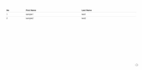
行ごとに下線が表示されます。基本的には他のclass属性もこの「table」とセットで利用します。
      <table class="table">
       <thead>
        <tr>
         <th>No</th>
         <th>First Name</th>
         <th>Last Name</th>
        </tr>
       </thead>
       <tbody>
        <tr>
         <td>1</td>
         <td>sample1</td>
         <td>test1</td>
        </tr>
        <tr>
         <td>2</td>
         <td>sample2</td>
         <td>test2</td>
        </tr>
       </tbody>
      </table>

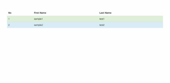
table-striped
先ほどのサンプルと同じで、各行に対して交互に色がつきます。
      <table class="table table-striped">
        ・・・
      </table>
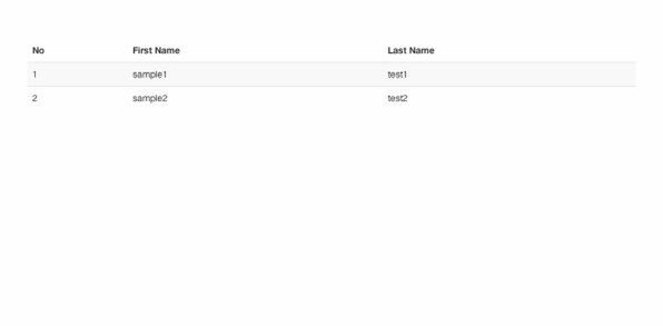
table-bordered
テーブルのすべてのセルに罫線がつきます。
      <table class="table table-bordered">
        ・・・
      </table>
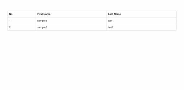
table-hover
マウスオーバーで灰色にハイライトされます。
      <table class="table table-hober">
        ・・・
      </table>
table-condensed
パディングを減らして行間を狭くします。
      <table class="table condensed">
        ・・・
      </table>
行の装飾
特定の行に色をつけるためのclassも用意されています。ここまではtable要素に指定していましたが、行の場合はtr要素にclass属性を追加します。
| class属性名 | 意味 | 色 |
|---|---|---|
| success | 成功 | 緑 |
| error | エラー | 赤 |
| warning | 警告 | 黄色 |
| info | インフォメーション | 青 |
      <table class="table">
        <tr class=”success”>
        ・・・
        </tr>
      </table>


